[Part 1] [Part 2] […] [Part 4] [Part 5]
This five part series will explore at length (warning!) and in detail (another warning—wonk alert!) the MMT perspective on the debt ratio and fiscal sustainability. While the approach suggests a macroeconomic policy mix and strategies for both fiscal and monetary policies that most neoclassical economists currently believe are unsustainable, ultimately the MMT preference for a significant role for fiscal policy in macroeconomic stabilization is shown to be consistent with traditional neoclassical views on fiscal sustainability.
This third part discusses the historical behavior of US interest rates on the national debt in the context of fiscal sustainability.
Interest Rates vs. Growth Rates Historically
If interest on the national debt is a policy variable, then we would expect to see interest rates on longer-term Treasuries follow the movements in the Fed’s policy stance, at least mostly. Others argue that the “natural rate” for these should be more in line with nominal GDP growth, which not coincidentally is consistent with neoclassical macroeconomic theory in which interest rates are about the “real” sector of the economy, not monetary variables as Keynes argued, but that’s a story for another day. There are a lot of nuances here, such as how or if neoclassical theory even accounts for interest rates of different maturities (or default risks, for that matter), but we’ll leave those aside as well. The issue to consider here is simply whether longer-term interest rates follow monetary policy—i.e., are a policy variable—or follow nominal GDP growth over longer periods of time.
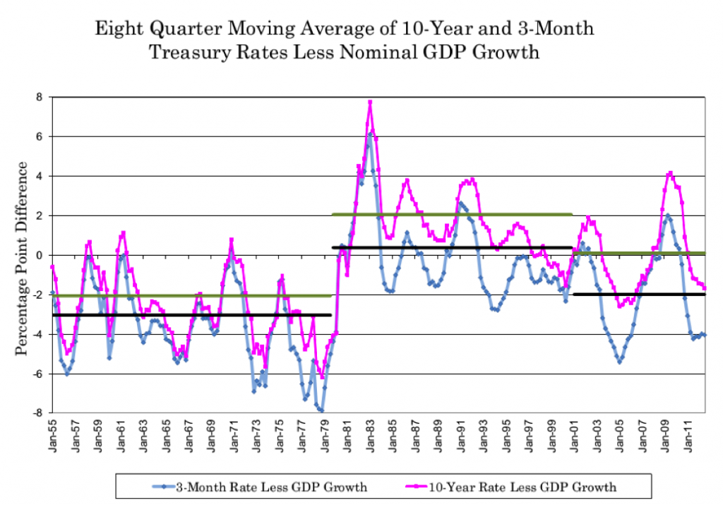
Figure 3—an update of Figure 8 from my 2006 paper—shows the 8-quarter moving average (to get rid of significant monthly and quarterly noise) of the 10-year and 3-month Treasury rates less nominal GDP growth. It’s well known that the 3-month T-bill and the Fed’s target rate are statistically equivalent essentially. So, if the 10-year rate follows monetary policy, we would expect to see the two moving together, which we obviously do. The relationship is not perfect, but magnitudes are similar and turning points are very similar.
The two horizontal bars represent the averages for 3-different periods—1953-1979q3, 1979q4-2000, and 2001-2012q3—with the lighter color, higher line being the 10-year rate less GDP growth and the lower, darker line being the 3-month rate less GDP growth. Since the average maturity of Treasury issuance is on average somewhere between these two, these should usually represent the high and low bounds for the average interest rate on the national debt relative to GDP growth; that is, the average rate of interest on the national debt relative to GDP growth should fall between the two horizontal lines. Note that, as a currency issuer, the US Treasury is under no obligation to issue longer-term Treasuries even in its current state in the “semi-strong form,” and if that were true or if it were in the “strong form” the lower bound alone would be the relevant one.
Figure 3

What’s striking in Figure 3 is how the upper and lower bounds clearly shift in the three different periods. The Fed’s shift to a higher interest rate policy stance in the 1979-2000 period is clear, and the move to a lower interest rate policy after 2000 and before 1979 are equally clear. Again, in all cases, the 10-year rate does the same. This suggests that anyone reporting data on interest rates relative to GDP growth must consider the shifts in monetary policy regime—for instance, considering only data since, say 1979, would be “cherry picking.” Indeed, if one were to include data going back to 10 or 15 years earlier than 1953, the same pattern of rates following GDP monetary policy regimes would also be present, and nterest rates would on average be below GDP growth in those years, too.
Key to the analysis here is that the average interest rate on the national debt is quite clearly below GDP growth aside from the 1979q4-2000 period.
The very negative growth in nominal GDP growth in 2008q4 and 2009q1 were historically large (the most negative since 1958), which arguably biases the averages reported in Figure 3 for 2001-2012q3 since interest rates do not go below zero when nominal GDP growth does. Figure 4 omits these two quarters from the 2001-2012q3 period’s average, which shifts the horizontal lines for that period down by 0.46%.
Figure 4

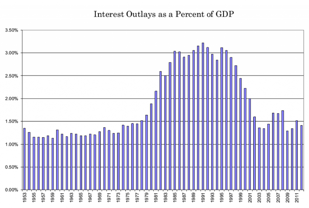
Figure 5 (another update from my 2006 paper) shows US Treasury interest outlays on the national debt as a percent of GDP. Quite clearly, the debt service ratio has followed the pattern of the average interest rate on the national debt relative to GDP growth and the stance of monetary policy more than it does the pattern of primary deficits (Figure 6 below, shown as the negative of the primary deficits for easier comparison to Figure 5). Note that the primary deficits during 1980-1990 averaged 1.0% of GDP and were largely comparable to primary deficits during 1971-1979 on average at 0.74%% of GDP, even as the former is normally thought of as a high deficit period and the latter is not; the difference between the two period in terms of total deficits is due to the near doubling of debt service during the 1980s, as average debt service for 1971-1979 was 1.4% of GDP and for 1980-1990 it was 2.65% of GDP on average. Obviously, debt service after 2000 has little to no relationship with primary deficits.
Figure 5

Figure 6

Lastly, Table 4 below shows the actual data for 1953-2012q3 and the three periods (1953-1979q3, 1979q3-2000, 2001-2012q3). It also adds data for the 2000-2012q3 period omitting the 2008q4 and 2009q3 data (the “01-12adj” row). Again, the data shows that the average interest rate on the national debt (which, again, lies between the 3-month and 10-year rates) has been below GDP growth for all periods except 1979q3-2000, and also for the entire 1953-2012q3 period.
One might be tempted to argue that the 10-year average for the entire 1953-2012q3 period is essentially the same as that for GDP growth, but this would be rather sloppy analysis given that (a) the average rate on the national debt will be lower than this, and (b) only the +2.06% difference during the 1979q3-2000 period of very high interest rates set by a shift in monetary policy regime enables the average difference over the entire period to be in the vicinity of 0%. Indeed, from the historical data, it is the high interest rates during 1979-2000q3 period that is the aberration. Nonetheless, never to be corrupted by actual evidence, among neoclassical economists, as Blanchard et al put it, “there is general agreement that the condition of an excess of the interest rate over the growth rate probably holds, if not always, at least in the medium and long run” (p.15).
Table 4
Average GDP Growth and Interest Rates

Overall, the data presented in this section suggests that (a) the interest rate on the national debt relative to GDP growth is more important than is the size of the primary budget balance in understanding the debt service ratio, which supports the MMT view that the debt service ratio, not the debt ratio, is what matters, (b) interest rates on the national debt follow monetary policy, and (c) interest rates on the national debt have on average been less than nominal GDP growth. All three of these are contrary to the neoclassical view of fiscal sustainability.
In part IV, we will (finally) integrate the content in the first three parts with the functional finance strategy for fiscal policy.


8 responses to “Functional Finance and the Debt Ratio—Part III”