
By L. Randall Wray
This blog is based on the testimony I provided to the US House of Representatives. My written statement will be published in the Congressional Record (a version is also at the Levy Economics Institute: http://www.levyinstitute.org/publications/statement-of-senior-scholar-l-randall-wray-to-the-house-budget-committee. The full statement was co-authored with Yeva Nersisyan.
I will argue that the Federal Government’s deficit and debt are not so scary as we are led to believe.
Neither the deficit nor the debt ratio is on an unsustainable path. In some sense, chronic deficits and a rising debt ratio are normal.
They are not due to out of control spending—now or in the future. They serve a useful public purpose. In any case they are largely outside the control of Congress.
It is hard to imagine a scenario in which rising deficits and the debt ratio will create a financial crisis, lead to government insolvency, generate high inflation, or trigger an attack by bond vigilantes. Figure 1 looks at government spending from several angles but just focus on the red line—which is total Federal Government spending as a percent of GDP. It is essentially stable since 1960.
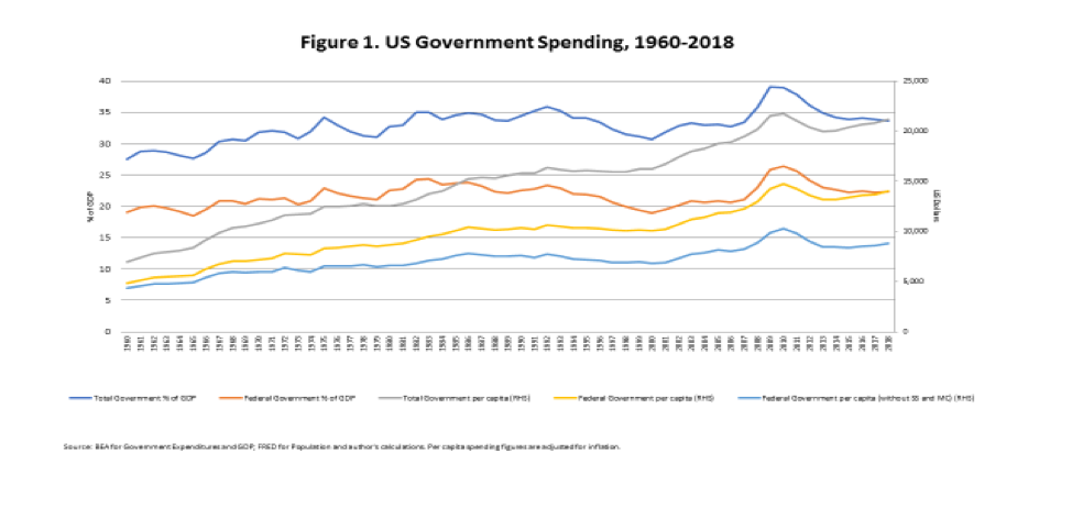
Figure 2 shows the deficit as a percent of GDP since 1930. Three things are apparent: we ran a deficit ratio as high as 25% of GDP during WWII; deficits are normal over the whole period—with only 2 short periods of surpluses; however, since the 1970s the swings are bigger and the average deficit ratio is higher.
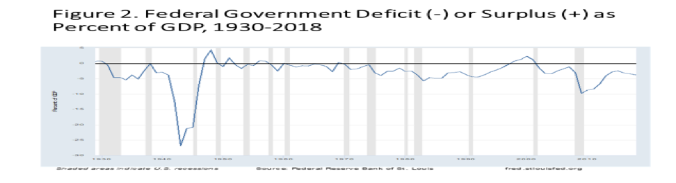
Figure 3 shows the debt ratio. The blue graph shows the debt held by the public as a percent of GDP. The long term trend is upward but there was a big boost due to the Great Recession; as well as after the Reagan and Bush Sr recessions.
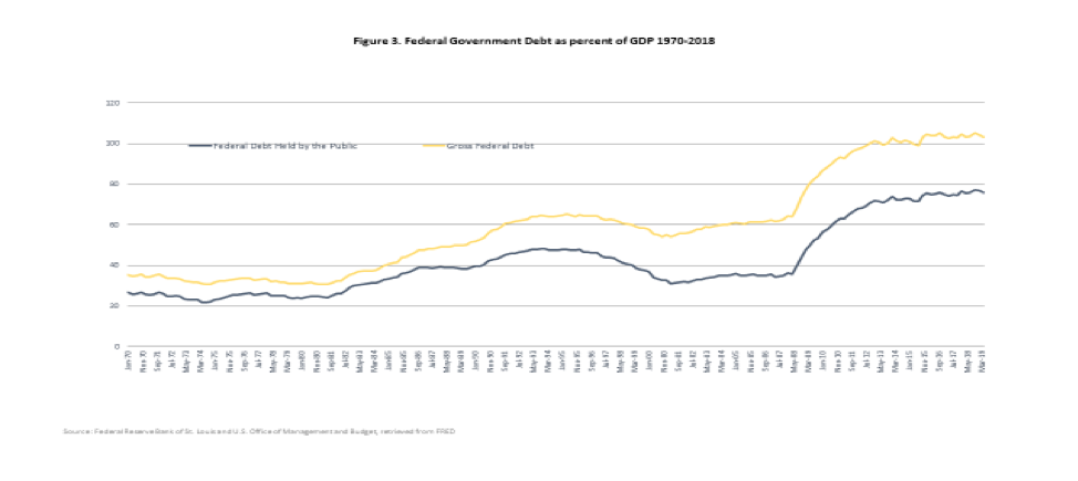
Table 1 (borrowed from Eric Tymoigne) shows that the long term trend is not new—the debt ratio has increased at an average pace of 1.8% since 1791. What has changed is that the rate of growth is higher since 1930. Before 1930 the debt ratio dropped in more than half the years—although the increases were bigger than the decreases. However since 1930 there have been only 5 years in which the debt ratio actually fell—and 83 in which it went up.
The next series of slides provides clues about this change.
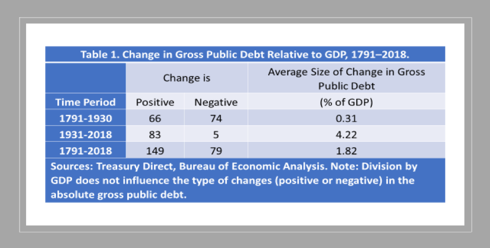
Figure 4 shows the countercyclical nature of taxes and transfer payments. Tax revenues grow in an expansion and fall in recession; transfers grow with a lag in recession and fall in expansion. However, the swings of taxes have become very much larger in the past 2 decades—falling off a cliff in a downturn. Interestingly, in the current expansion, the growth rate has been unusually low.

Figure 5 breaks taxes down into the withheld and nonwithheld types. Both swing with the cycle, but nonwithheld taxes swing more wildly especially in recent years. However note that under Trump, withheld tax growth has dropped like it usually does only in recession.
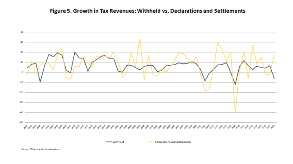
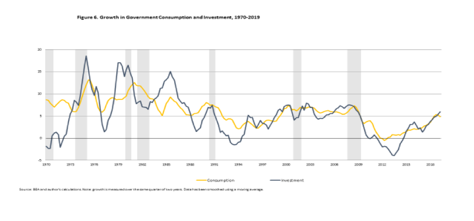
Figure 6 breaks government nontransfer spending into consumption and investment. Swings of these components do not follow a clear countercyclical path—if anything they are somewhat procyclical, rising in an expansion and falling in recession.
All in all we conclude that Federal spendingprovides a modest stabilizing role, mostly through transfer payments—but that has weakened in recent decades. Taxes play the bigger stabilizer role but they are more effective at reducing the drag in a recession than at pulling out demand in expansion.
US sectoral balances are shown in Figure 7. At the aggregate level spending equals income by identity. One sector can spend less than its income (run a surplus) only if at least one other spends more than its income (runs a deficit).

The government sector taken as a whole is red. You will notice that with the one brief exception during the Clinton years, the red is always in deficit—below the line.
On the other hand, the private sector, including firms and households and shown in blue, is almost always in surplus. The exception was during the decade between 1996 and 2006 the private sector spent more than its income. This coincides with the period of the Clinton surplus.
The final sector, shown in green, is the foreign sector—or rest of the world. It has run a surplus balance since the Reagan years. That is because we run a current account deficit—to simplify we can say this reflects our trade deficit.
So the usual case is that the government’s budget deficit equals the sum of the private sector’s surplus plus the current account deficit (with its sign reversed). This is an identity.
Anyone who is going to argue for eliminating the budget deficit must tell us which of the other two balances is going to change so that can happen.
Are balanced budget hawks also advocating to eliminate the private sector’s surplus and run deficits again—as they did in the dot com and housing bubbles? If so, how will we avoid another Global Crash?
Or are they suggesting we’ll get the rest of the world to run deficits so that we can run a current account surplus? We’ve had a current account deficit for half a century—and the Trump Administration’s tariffs have reduced international trade but have not yet significantly reduced our current account deficit.
Even if we could control our imports, we can’t control exports.
Understanding sectoral balances leads us to conclude the Federal balance is not under close control of Congress because the outcome depends on the other 2 sectors. Even if we can control Federal spending (which has not been growing as a percent of GDP), tax revenues depend on economic performance—which also goes into determining the other 2 sectoral balances.
The budget deficit is endogenously determined—growing when the economy slows and falling when growth picks up. That’s not always the case but it is the best case scenario because it is stabilizing. Figure 8 shows the relation between economic growth (horizontal axis) and the Federal government deficit (shown as positive on the vertical axis). Surprisingly, there’s no obvious relationship.
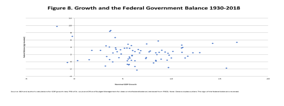
We can obtain the same deficit ratio—say 4%–with a wide variety of growth rates. We could hypothesize that we can move from a 4% deficit ratio to an 8% deficit ratio in either the good way or the ugly way—as shown in the next graph.
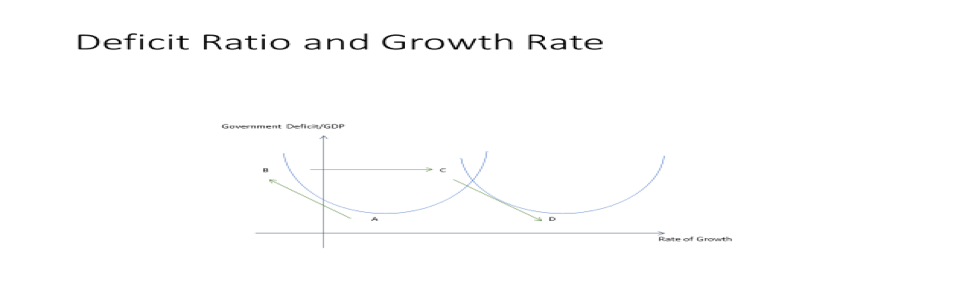
Start at point A, which shows a deficit ratio of 4% with a growth rate of 4%. Now let’s cut spending or raise taxes in an attempt to cut the deficit. If this slows growth, we could move up to point B—with a deficit ratio of 8% and negative growth. That’s the ugly way to produce a bigger deficit.
That is the Japanese way. Whenever the economy begins to escape stagnation, the government adopts a new consumption tax that kills the recovery and causes the deficit to grow.
Or we can increase the deficit the good way, by embarking on a public infrastructure investment campaign. We move from point A to point C. The increased spending boosts the deficit and economic growth. However, as growth picks up, tax revenue grows and we shift down the arrow to Point D—with a lower deficit and higher growth.
That’s the good path to deficits. Of course that’s all hypothetical. We can actually trace the path of the combinations of deficits and growth in the following two graphs.
Figure 9 shows the decade from 1991-2001 as a relatively high budget deficit at the beginning of the decade boost growth, and maintenance of high growth shrinks the deficit over the rest of the decade until a surplus is generated. However, that killed the boom.

Figure 10 shows a loop-da-loop as the deficit rises after 2001, as the economy recovers until the mid 2000s, crashing into the Great Recession that drives the deficit to 10% of GDP in 2009. Over the next decade, growth settles in at a 3-4% pace and the deficit comes down to the range of 3-4% of GDP
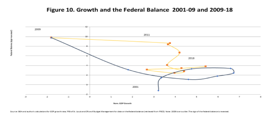
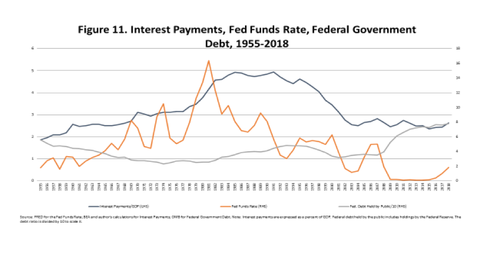
Figure 11 displays the interest on the debt as a percent of GDP—rising sharply through the mid 1980s and then settling at about 2.5% of GDP for the past 15 years. That is in spite of the rising debt ratio (grey line, which scales the debt ratio). The fed funds rate (red, right hand scale) is the main driver of the debt service ratio. That is why interest payments by government have remained low for the past 20 years even as the debt ratio has risen.
In case someone objects that while the Fed controls the federal funds rate, bond vigilantes determine rates on longer maturities, this graph shows that the correlation of the ffr to long rates is very high. And, of course, the Fed can perfectly control long rates if it is told to do so. (Thanks to Eric Tymoigne for supplying this graph.) The Fed is the only bond vigilante we need to worry about.
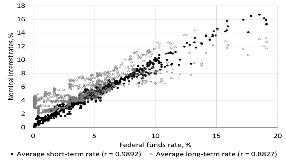
Figure 12 displays Federal government debt to world GDP. As a percent of global GDP, the debt ratio has gradually climbed back to where it was in 1960. In 1960, however, the world was on the Bretton Woods system, in which the US dollar was pegged to—and competed with—gold. Today the Dollar is the primary international reserve currency. The portion of Federal debt held abroad has been running approximately 40% to nearly half. Hence, the ratio of Federal debt to global GDP is less than 6%.
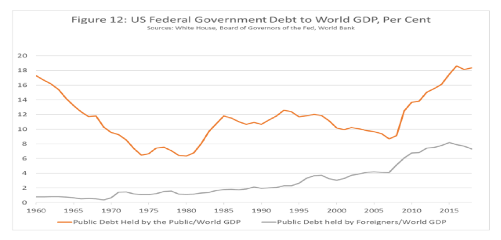
This could be the more relevant yardstick for measuring the debt ratio for the international currency reserve. The largest foreign holders of US government bonds are foreign treasuries and central banks; most of the rest is held in financial institutions and particularly in offshore banking centers. Other than the offshore banks, US treasury holdings are mostly accumulated by countries running bilateral current account surpluses against the US.
It is highly unlikely that the demand for US dollars is even close to satiation. International exporters often trade with the US because they want US dollars—often because they need them for imports or to manage their exchange rates.
Further, in the last global financial crisis, there was an immediate run to dollars, only relieved by massive intervention of the Federal Reserve—which originated over $29 trillion in loans, of which approximately 40% went to foreign banks and much of the rest went to private global banks. US treasuries are held as the safest financial assets in the world.
So, you can stop worrying about Federal government debt and deficits.


4 responses to “STATEMENT: House Budget Committee, “Reexamining the economic costs of debt”, Nov 20, 2019”