(A response to Forbes’ Scott Winship)
By Pavlina Tcherneva (revised 10/10/14, 10/11/14)
For the last few years, I’ve been studying the recovery and the kind of monetary and fiscal policies that are conventionally used to deal with recessions. One of the questions I considered was not just how we grow, but who benefits. The answer to the first question, I argue, provides insights into the second.
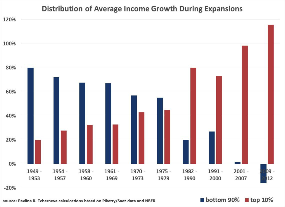
Examining the widely-used Piketty-Saez data, I found that the way we grow in the U.S. brings inequality. Namely, with virtually every postwar expansion, a greater and greater share of the average income growth has gone to the wealthy 10% of families. In the immediate postwar era a declining share of growth went to the bottom 90% of families (a trend not to be ignored), but they still captured the bulk of the growth in average incomes. Since 1980, however, the majority share has gone to the rich, while in the latest expansion they captured 116% of that income growth. This seemingly absurd result is due to the fact that incomes of the bottom 90% of families during the 2009-2012 period have been shrinking.
After the chart went viral online and was featured in the New York Times, Slate, Vox, NPR, CNN, and multiple other outlets, Forbes’s Scott Winship posted, as far as I can tell, the only challenge to the graph.
Winship goes through a series of adjustments using data from Piketty-Saez and the CBO to produce, in his words, a “very different” picture. Here is a summary of what he claims:
- One should use households, not tax units
- One should look at business cycles, not expansions
- One should exclude the baby-boomers or add transfers and subtract taxes
- One should exclude capital gains (but again, add transfers and subtract taxes)
Some of his adjustments actually confirm that sizable inequality exists between cohorts. Only after he makes all adjustments to produce what he calls ‘his money chart’, he concludes that income distribution has been improving since 1990, relative to what he finds to be a drastic erosion in the 70s and 80s (see the final chart on his post). What’s going on here?
Despite a number of sensible comments about the difficulty with gathering and measuring data, his ‘corrections’ 1) either do not tell a different picture, or 2) are outright misleading and incorrect.
Briefly.
- When he uses household data, he confirms my findings and trend
- His business cycle charts are incorrect. I present my business cycle data here and the picture is even more depressing than in my original chart
- The elderly do not artificially depress income at the bottom as much as he says they do. Actually, Piketty data understates incomes at the top. If you want to include all forms of income for the elderly, you have to do the same for the wealthy. Can’t have it both ways.
- Excluding capital gains is fundamentally misleading and essentially assumes away the problem. There are better ways to deal with the difficulty of measuring capital income.
In detail.
1. Households vs. tax units.
Agreed. Average incomes for households are higher, but I use Piketty-Saez data as the most reliable long term data that’s out there. Winship’s household data essentially reproduces my trend with uncanny similarity.
MY EXPANSIONS CHART
HIS EXPANSIONS CHART
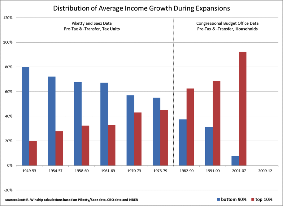
If anything, his data makes a stronger case for the steady rise in inequality by showing an even smoother downward trend for the bottom 90% with no uptick in the 1990s expansion.
I still think Piketty-Saez’s data is more helpful here, because the uptick one sees in my chart during the 1990-2001 expansion, reflects the tightening labor markets and real wage increases during the late 90s, thereby reflecting how the income generating mechanism for the bottom 90% of tax units improved (even if marginally). Labor market conditions, employment and earnings are key explanatory variables in the erosion of income distribution.
Winship’s chart omits to report the period since 2009 because, he argues, the expansion is not over. Surely that’s the case, but we can still get useful information by looking at how income grows while it is growing, even if the cycle has not come to an end. This brings me to his second point that we should be looking at business cycles.
2. Business cycles
(There has been some confusion about my argument in this section. I have added comments of clarification below to explain my specific objections)
There is a big problem with the way he looks at cycles. Observe the x-axis for all business cycle charts on his post. Below I show the one he constructs using the same Piketty-Saez data I use.
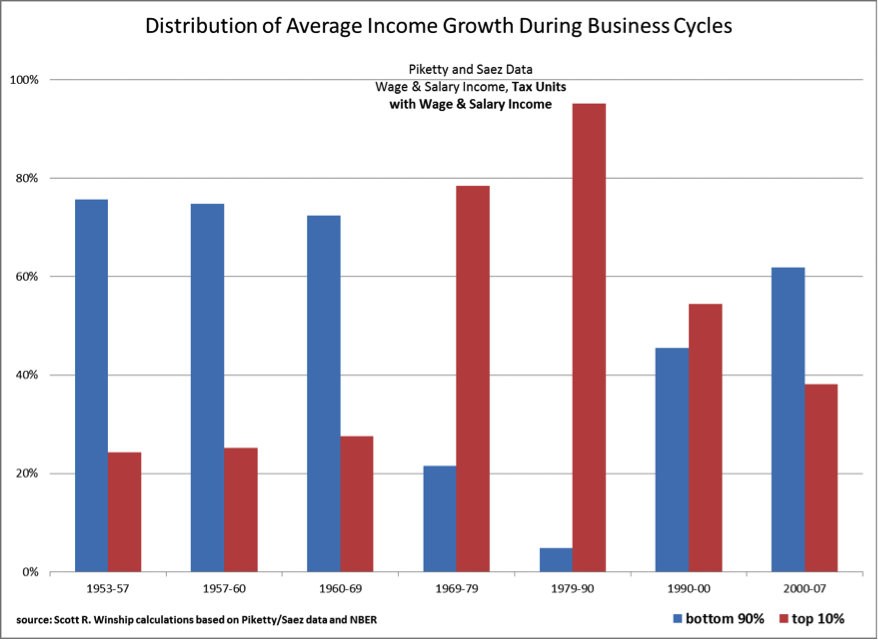
From his chart, it looks like the income distribution has been improving drastically since the 90s, after rapidly eroding in the 70s and 80s. Pay attention—eventually—his final ‘money chart’ will show the same sort of trend, but that would be because he’s calculating his business cycles incorrectly (and I am forced to conclude, based on what you are about to read, deliberately so because, he doesn’t like the outcomes that derive from correct business cyclical calculations…I can’t think of any other possible motive)!
Why is he double reporting some of the years? For example, according to him, one business cycle is 1953-1957, while another is 1957-1960. Why include 1957 in two separate measurements? (He does this for all business cycles). Because of this ‘double reporting,’ the business cycle chart does not deliver any useful information
(Comment 10/11/14: by “double reporting”, I mean that he is double reporting a growth rate (and its distribution between cohorts) that has occurred in a given peak year in two separate business cycles. In other words, if a certain growth rate occurred in the year 1957, he seems to be including it both in cycle 1953-57 and in 1957-1960. This is the only way that I could make sense of these numbers. I have tried to replicate this exact chart using the Piketty-Saez spreadsheet and I find completely different trends and levels—his numbers for all business cycles look much better in favor of the bottom 90% of families and his “improving” numbers during the last 25 years also cannot be replicated. See more comments below).
You may be tempted to look at it as a measure of how income gains are shared over time by business cycle, but you’d be wrong, because depending on which two years are reported twice, the numbers will be very different (or much better, in his case).
More importantly, his choice of what constitutes a business cycle is incorrect and inconsistent with NBER data. For example, Winship considers 1968-1979 to be a business cycle, but that’s was not the cycle. Peak income year was 1969; income then declined and rose to its next peak in 1974. After 1974 income fell again and gradually recovered to its subsequent peak in 1980. So he’s lumping two cycles into one. NBER data clearly shows that there were two recessions during that period and two recoveries.
But if you follow my method, which I explain next, you see that these two business cycles brought very different distributions of the income growth. Lumping them together makes his numbers look better in favor of the 90%.
MY BUSINESS CYCLE CHART
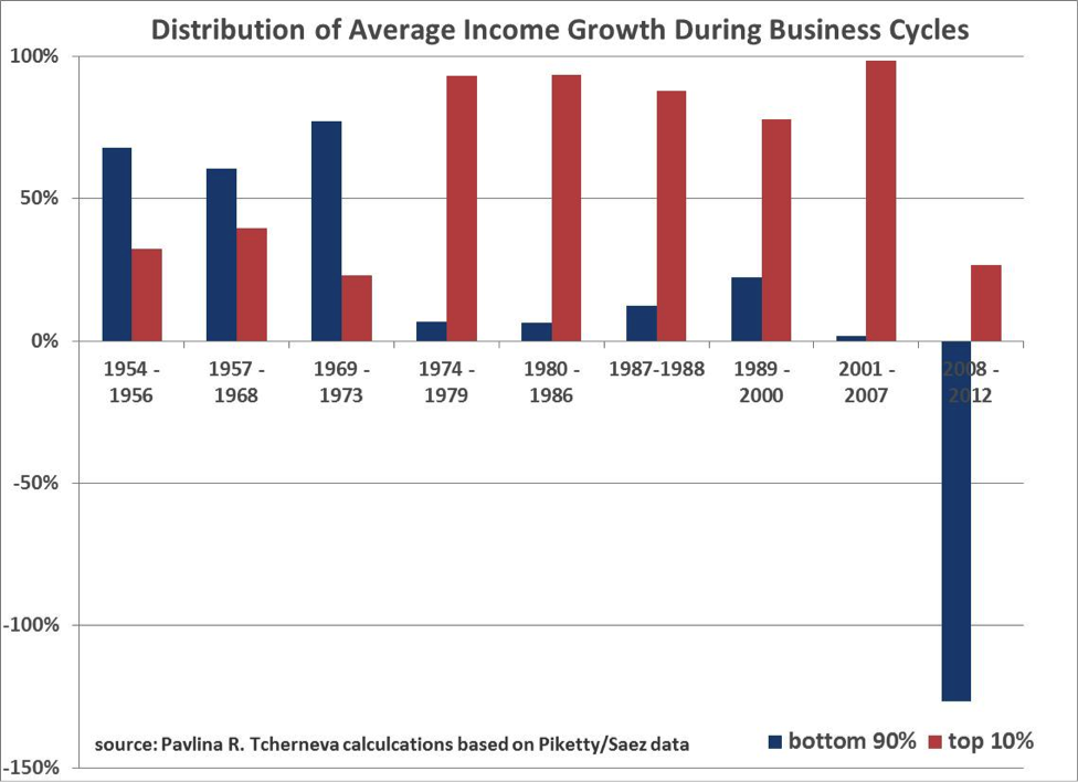
I examine periods from peak year to peak year, but I do not double report the growth rate that occurred in peak years. (Comment 10/11/14: There are two ways in which we can do the calculations. One is to take the year after a peak to the actual subsequent peak year and the other is to take peak-to-peak year). Let’s take the first one. For example, looking at the Piketty-Saez spreadsheet, the year 1988 was a peak year for average income, it then started declining in 1989, 1990, and all the way until 1996, when it began gradually recovering culminating in another peak income year in 2000.
So to look at the business cycle, I measure the share of income growth by each cohort from 1989 (the year after the peak year) to 2000 (the actual next peak). The next business cycle then starts from 2001 (again, the year after a peak year) to the following peak of 2007, and on and on. Thus, my chart measures all cycles in a consistent manner based on the actual observable data. So you can actually look at my chart over time and ask the question “How does each business cycle redistribute the gains from average income growth”. You cannot do the same with his chart.
Winship says that he’s looking at peak to peak, but some of the end periods on his chart are not peak years. For example, when you consider the Piketty-Saez spreadsheet from which he derives his ‘business cycle chart’, 1990 was not a peak year for income, which biases his numbers. The peak year was 1988 and my method reflects this.
What my ‘business cycle’ chart shows is an even more depressing picture than my original ‘expansions’ chart. Almost all income gains switched their destination—until the early-70s they largely went to the bottom 90%, but after that, during every subsequent business cycle, the overwhelming majority of gains (78-98% of them!) went to the wealthiest 10% of families.
There is no downward trend here. There is a profound paradigm shift in economic business cycles.
The second method is to look at peak year-to-peak year, but without double reporting the growth rate that occurred in a given peak year. You still get a fundamentally different picture from what Winship reports. He is actually not picking the peak years in income as reported in the Saez-Piketty spreadsheet. If we were to do a proper peak-to-peak graph, we get this:
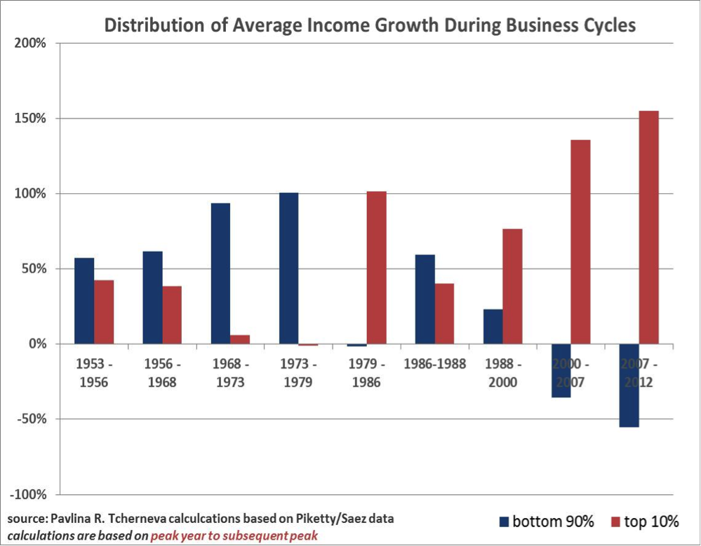
The reader can decide which of these two depressing charts tells the actual business cycle story. The bottom line is that Winship’s business cycle chart is wrong (and it shows a completely different and incorrect trend in the distribution of income gains over the last 25years). And I cannot figure out how he has chosen his data points. (Comment 10/11/14: I added this last chart in response to his objections about what is the proper way to measure a business cycle. Now readers have both measures and can take their pick. In either case, they do not confirm his growth shares or trend. Indeed, both corroborate my original ‘expansions’ chart.)
What the business cycle data shows is that, no matter how much the rich may lose in a recession (Piketty-Saez data show that they don’t always lose disproportionately more), during expansions, they more than make up any lost ground, which is exactly what my original expansions chart showed.
Winship’s chart does not show business cycle data for the latest period, again arguing that the cycle is not over. Surely, but why refuse to look at the progress we have made so far?
My business cycle charts show that, even though incomes of the rich collapsed due to the stock market crash of 2008, they have more than made up their losses, whereas the bottom 90% have suffered disproportionately over this latest (albeit incomplete) business cycle. Average incomes may have turned a corner but were still lower in 2012 than they were in 2008. By contrast incomes for the bottom 90% were continuously declining during that period. So when we look at which cohort bears the brunt of the overall average income decline, it’s the 90%. In fact, under the first method, we get another strange number (-127%), which means that the entire decline and more is accounted for by the bottom 90%, because incomes of the richest 10% rose at a time when overall average incomes fell.
To sum up, the charge that looking at expansions is a big ‘no-no’ is completely misguided. When overall inequality is increasing overtime (which the work of Piketty and others has demonstrated) and the share of growth increasingly goes to the rich during expansions (as my original chart showed), one knows exactly what’s happening over the business cycle. And now you have the data to put any doubts to rest.
3. Baby boomers
Note that, from here on out, all charts that Winship uses are ‘business cycle’ charts, which suffer from the problems I just discussed and one really can’t make any sense of them (which why I am also not reproducing his chart that measures pre-tax, post-transfer income for the nonelderly, even though it displays a similar inequality trend since 1979–the first year for which CBO reports data– as my original chart).
I used pre-market/pre-tax income because I wanted to know what the economy is doing on its own terms before the government gets involved to redistribute income after it has been generated. The fact that incomes are redistributed though tax policy and transfers, means that the government is doing its proper role of providing a safety-net. But if the distribution of income improves because larger and larger transfers are required to ‘equalize’ incomes, clearly the income-generating mechanism for the vast majority of people in the economy is broken. But as I will discuss below, measures that look at after-tax, post-transfer data, still show worsening inequality.
The question of the baby boomers and that of capital gains revolve around the same major concern: does excluding/including various sources of income bias the numbers? Whereas Winship argues that my use of Piketty-Saez data overestimates inequality, my argument is that they actually underestimate it (and there is research to back it).
(To the non-economist, these statistical adjustments may seem like benign methodological issues, but behind the decision to include/exclude certain data lay much more fundamental concerns.)
We can’t exclude the elderly using the Piketty-Saez data, but even if we could, as Winship himself argues, the elderly effect would not be very big as trends in the bottom 90% are likely to be very similar. The proper correction however, is not to remove them from the data but to account for all forms of income. Except Winship wants us to include the transfer and tax effect but exclude other sources of income that tend to benefit the wealthy, e.g., capital gains. You can’t have it both ways.
My colleagues at the Levy Economics Institute have devised a comprehensive measure of wellbeing that accounts for all sources of income—The Levy Institute Measure of Well Being (LIMEW). The LIMEW looks at households and accounts for income from wages and salaries, cash and noncash transfers, home and non-home wealth, employer contributions to health insurance, public consumption and household production, minus taxes.
What do we know about the elderly when we use the superior LIMEW measure? We know that they are better off than the conventional measures suggest (in other words market income measures make them look poorer than they actually are—but this is true both for the poor and the rich elderly—and they seem ‘poorer’ in large part because those measures do not account for income from non-home wealth). Importantly, what the LIMEW finds is that income inequality is much worse for the elderly than it is for the non-elderly population—the disparity between the wealthy and the poor baby boomers is greater than that of the non-elderly top 10% and bottom 90% of households.
But that’s just it, isn’t it? Why remove the elderly from the picture or only account for transfers, while excluding capital gains? By definition that would make the income distribution picture rosier, wouldn’t it? It is a perfect sleight of hand.
4. The case for including capital gains
IRS research that examines the wealth-income nexus indicates that tax returns largely understate the economic status of the wealthy and that income alone (that is, excluding capital gains and other income from wealth) is not a prudent way of measuring individual well-being.
Again, the Levy Institute LIMEW measure studies the dynamics between wealth from asset ownership and other income sources and demonstrates two key things:
- inequality has been worsening overtime and
- it is due, not to gains in wage income for the rich, but to income from nonhome* wealth.
But there are much deeper and more important problems with excluding capital gains.
4.1 Balance sheet effect
Excluding capital gains, removes the balance sheet effect from the discussion.
The bottom 90% of families are generally paid in wages and salaries, which have not kept up with productivity growth, whereas the ultra-rich are increasingly paid in an appreciating asset (e.g., stock options and carried interest).
Furthermore, there is a fundamental difference in the way the wealthy finance their activities. The position making instruments for the wealthy are assets that quickly recover in value after a downturn. For the bottom 90% as earnings prove inadequate, spending has been increasingly financed through debt. And the main asset they have used as collateral (the home) has not recovered in the same way share prices have.
This is not an accident. As I’ve argued in the journal article, where my chart first appeared, macroeconomic policy explicitly recovers corporate profits and asset prices, while failing to stabilize labor markets and housing values. More importantly, policy fails to reduce unemployment quickly, improve incomes from wages and salaries, and secure anything close to full employment over the long run. In other words, the way we grow the economy explicitly and directly favors one cohort over the other.
But Piketty-Saez data underestimate the problem, anyway. Levy LIMEW research finds that conventional money income data:
- Understate the portion of the total economic pie that goes to the rich and the relative importance of wealth for the well-being of the rich;
- understate the degree of overall inequality and the contribution of income from wealth to the increase in inequality
- Overstate the relative well-being of minorities (an important topic we haven’t even touched!)
4.2 Wealth effect
Winship wants us to consider the wealth effect for the poor, but wants to exclude the wealth effect for the rich. He argues that housing and 401K are ‘especially important’ for the bottom 90% (sure they are, when incomes are stagnating). But then what you have to consider all forms of wealth (and wealth is far more unequally distributed than income).
But you will also want to do an erosion test and see how much the bottom 90% of families are withdrawing from their 401K during downturns to meet cash flow commitments. And don’t forget the very high penalty fees they pay for early withdrawal. The wealthy have greater capacity to weather a downturn and thus have more discretion in the timing of their asset liquidation. In fact, the way the wealthy cash out, according to IRS research, is due to preferential tax treatments that are not available to the non-wealthy.
And aren’t these preferential tax rates one giant implicit government subsidy to the wealthy? If you want to account for government transfers, then the transfers to the rich surely have to be part of the exercise. Again, you cannot have it both ways.
4.3 Tax treatment and transfers to the rich
The wealthy have an array of tax advantages and asset management techniques, not available to the bottom 90%. Consider the important problem of carried interest, which finds no mention in Winship’s article.
Carried interest is the share of profits a fund manager gets as compensation. Think of it as a ‘performance’ fee. A manager would be paid a base fee in cash from the fund and an incentive fee (usually between 20-25%), which is awarded as an imputed interest in the fund. Say, if the fund has $100m in capital and earns $10m, after the base fee is paid, the ending capital value will be $110m. The manager’s 20% stake in the fund would be $2m, while the investors would own $108m. For many of the ultra-rich, carried interest is a major source of compensation that does not appear on tax returns until it is taken. Recall the Mitt Romney scandal. He earned $13m from “carried interest” over the course of two years, and when the money was taken, Mitt (like other fund managers paid in carried interest) took advantage of a tax loophole allowing him to pay the much lower capital gains tax rate on that income, rather than the higher marginal income tax rate.
Now, what is capital gains treatment if not one giant transfer payment of government to capital? It is a preference given to holders of capital—the wealthy—at the stroke of a pen.
Note, I haven’t even discussed stock buybacks. Turns out S&P500 companies spend almost all of their profits on buybacks. Consider what happens when a firm pays management in stock options, and then uses the firm’s cash to buy back shares, thereby boosting their share price. This amounts to management taking cash out of the firm and paying it to itself.
There really isn’t another way of putting it: this is rent seeking on steroids.
4.4 The fundamental issue of value
Fundamentally, the issue of capital gains boils down to an ideology supporting the view that the earnings on capital are somehow ‘special’ or more ‘productive’ than earnings on labor, and should thus get a preferential tax treatment.
Often those who want to exclude capital gains argue that even if income of the ultrarich has been rising, it is because they are ‘working rich’ and it is ‘earned’ income linked to their high productivity (ahem, “carried interest,” anyone?). In fairness, Winship has not made this argument, at least not in the article where he critiques my chart. But his ‘corrections’ (which are incorrect), essentially serve the narrative of the inequality deniers. And while many of them would argue that the so-called “working rich” have replaced the “coupon-clipping rentiers” at the top of the economic ladder, the work of my colleagues at the Levy Institute has clearly shown that it is precisely the opposite.
Inequality is about power—economic, political, and social. It is about command over resources. While all data is flawed to a degree, observing capital gains allows us to see the fundamental structural shifts that have occurred in how income has been earned.
Winship’s last correction to capital gains, under the guise of methodological problems with measurement, essentially sweeps all of these considerations under the rug. Better measures accounting for wealth and transfers are available and they report even more serious disparities. And if one considers carried interest, stock buy backs, and preferential tax treatments, one could argue that the rents extracted by the ultra-rich are much much higher.
If anything, my original chart underestimates the magnitude of the problem.
* “nonhome wealth equals the sum of (1) other real estate owned by the household and net equity in unincorporated businesses; (2) cash and demand deposits, time and savings deposits, certificates of deposit, money market accounts and the cash surrender value of life insurance plans; (3) government bonds, corporate bonds, foreign bonds, and other financial securities such as corporate stock, mutual funds, and equity in trust funds; and (4) the cash surrender value of defined-contribution pension plans, including IRAs, Keogh, and 401(k) plans; less other (nonhome) debt such as auto and credit card loans.” (Wolff and Zacharias, 2009)








Pingback: Grasping at straws and more trickery from Forbes’ Scott Winship - New Economic PerspectivesNew Economic Perspectives