By J.D. Alt
1. The “unsolvable” riddle of our National Budget
Being an architect, I’m fascinated by diagrams visualizing things which otherwise are invisible. In designing a building we usually begin with diagrams to explore and understand the functional and spatial relationships—the flows and often unexpected interactions—the architecture needs to accommodate. Getting the diagrams right is important—if they’re wrong or incomplete, the building we design could turn out to be a dysfunctional disappointment for its owners and users.
With this in mind, it occurs to me the reason our current Congressional leaders are having such a difficult time with our National Budgeting process is because they’re trying to design a “building” based on an incorrect diagram. No matter how they add up the numbers, they seem incapable of devising a budget that builds America forward in a positive way. In fact, their budgetary efforts more closely resemble the actions of a wrecking crew than a construction team!
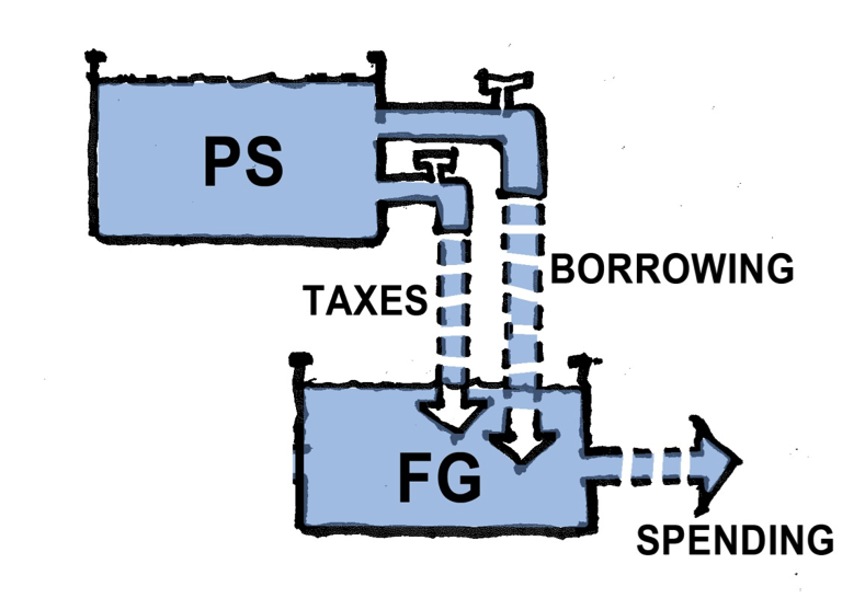
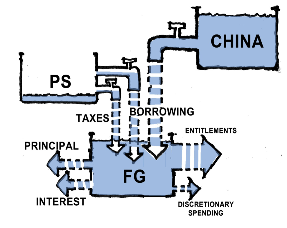
Here is my best effort to construct the diagram it appears the Congressional leaders are presently trying to use. I’m putting it together, as best I can, from the story they tell us, every day, about the fiscal dilemmas they are struggling to resolve. This diagram is also powerfully reinforced by a news media spinning and reporting daily on the politician’s seemingly futile efforts:
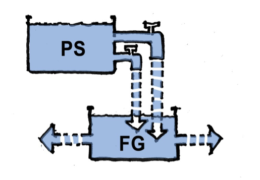
The main features of the diagram are two “pots” containing Dollars. One pot is labeled the Private Sector (PS). This is basically the national economy—businesses and corporations, families and foundations, state and local governments, etc. All the transactions that occur in the Private Sector (PS) pot add up to what is called the GDP (gross domestic product). The second “pot” is the Federal Government (FG), and the Dollars contained in this pot are SPENT to pay for public goods –weather forecasting, bridge repairs, Medicare services, etc.—and to make the “transfer” payments like social security, unemployment aid and food stamps that many Americans depend on to one degree or another.
The diagram shows that the Dollars in the Federal Government (FG) pot are obtained via two spigots in the Private Sector (PS) pot: one spigot is TAXES, the other is the “BORROWING” spigot through which the Federal Government (FG) obtains Dollars by “selling” Treasury Bonds to the Private Sector.
2. Diagrammatic Dilemmas
This diagram seems pretty straightforward and obvious, although there are aspects of it that are less than clear. For example, the diagram gives Congressional leaders the clear impression that the Private Sector somehow creates the U.S. Dollars we all use, though there is no exact articulation about how this occurs. The PS pot is clearly full of Dollars—they had to come from somewhere, right?—but the diagram shows no source other than the PS pot itself. There is a vague “story” about entrepreneurs investing Dollars in business ventures which make profits, allowing them to hire more and more workers, which enables them to generate more and more Dollars, etc. How the money is actually created seems to matter less than the “obvious” fact that if the two spigots draining Dollars out of the PS pot are opened too wide—if too many Dollars are drained out of the PS pot into the FG pot—the entrepreneurs won’t have enough money left to invest in creating jobs and making profits, and the Private Sector GDP (Gross Domestic Product), as a consequence, will begin to shrink.
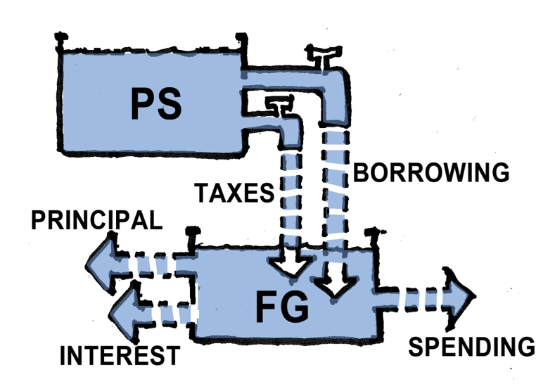
It is fear of this shrinkage that appears to constrain the number of Dollars that Congress can allow to flow into the FG pot, and this, of course, constrains the amount and kind of public goods and services that can be planned for in the National Budget. This fear is exacerbated by another which can be visualized by looking at the diagram in more detail:
As illustrated, the “BORROWING” spigot appears to require that the Federal Government not only to pay back the Treasury Bond’s principal at some point in the future, but also to pay interest on that principal. Following the logic of what we’re looking at, it appears the Federal Government will be forced to collect even more taxes at some point in the future (to pay the principal plus interest) creating a huge financial burden for our children and grandchildren. As a result, it seems clear to Congressional leaders that the “BORROWING” spigot must be carefully constrained to not exceed a certain percentage of the Private Sector pot, or else—it seems mathematically obvious—the TAX spigot ultimately will have to drain the P.S. pot completely just to pay for the government’s debt! This is what is meant when the Congressional leaders say the Federal Government’s debt is “out of control” or “unsustainable”.
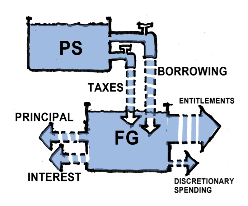
We can also look at a close-up of the FG spending side of the diagram, the side which generates the Public Goods and Services we collectively benefit from.
Looked at more closely, that spending is really of two kinds: “Entitlement” spending and “Discretionary” spending. Here too the diagram seems to illustrate the enormity of Congress’ fiscal dilemma: As Entitlement spending (Social Security, Medicare and Medicaid, Food Stamps etc.) grows larger, it has to compete with the Discretionary spending (infrastructure, education, medical research, etc.) for the limited number of Dollars that can be allowed to flow into the PG pot. Thus, if we plan to take care of our elderly, under-nourished, poorly housed, accidentally disabled, under-educated and unemployed citizens—which somehow seems an ever-growing need as the population increases and ages—our airports, highways and bridges, our water and sewer systems, our electrical grid and public transit systems, all of that (and more) must inevitably fall into disrepair.
Or, as many Congressional leaders warn us against, we’ll be forced to borrow even more Dollars from China, hastening the inevitable wreckage and bankruptcy of our economy:
It is easy to see how, using this diagram as a guide, it is literally impossible for our Congressional leaders to come up with a rational and constructive budgetary plan to build America’s future. This has got to be a big part of why, whenever they appear on television, our Senators and House Representatives are wearing such pained expressions. And, no doubt, this diagram is a large part of the reason they so relentlessly fight and bicker over every topic imaginable, because every topic imaginable seems ultimately tied to the frustrating fact that we simply don’t have enough “money”.
3. Diagram Reality Check
In order for a diagram to be useful, it has to be accurate. But how do we know if a diagram is accurate—that it reflects the actual realities we are dealing with? First, we could ask if all the “parts” have been accounted for. Maybe some important things have been left out. Then we could ask if the relationships and flows are correctly portrayed. Since our diagram seems to naturally follow a “plumbing” metaphor**, we could ask, in essence, have we got the “plumbing” right?
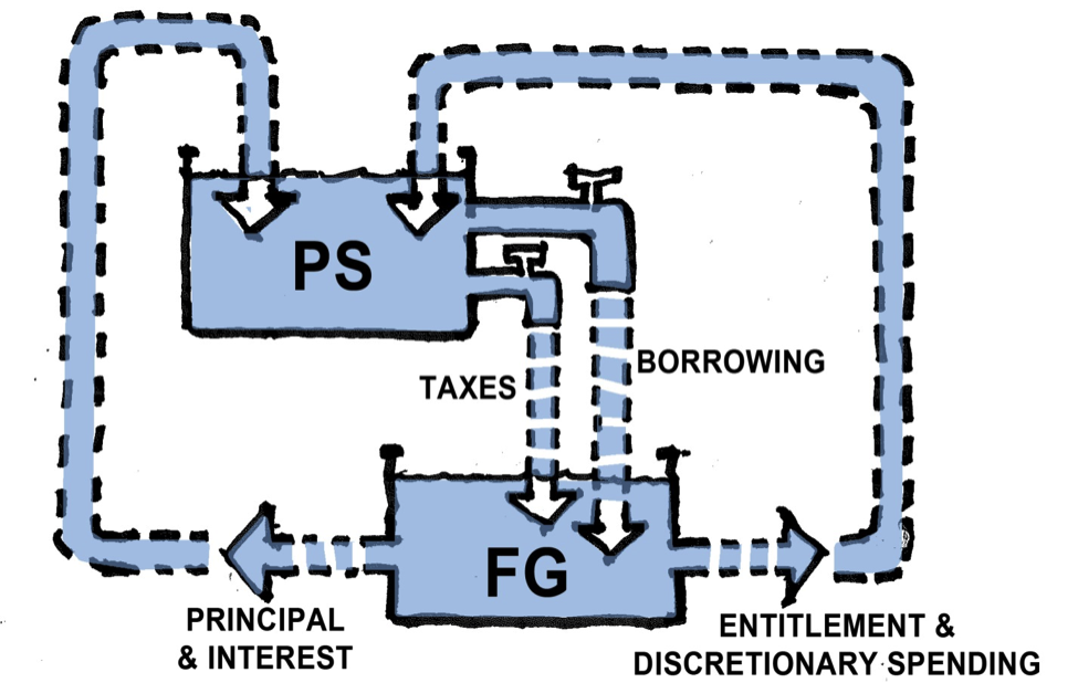
The first thing we can see pretty easily is that the diagram has, indeed, left out some key parts of the fiscal “plumbing”. The Dollars that flow out of the FG pot to pay for public goods and services—either entitlement or discretionary spending—don’t just disappear into the right page margin after they are spent. They go somewhere. They are paid to somebody. And who might that be?
In fact—and when you think about it, it’s obvious—the Federal Government buys its public goods and services from the Private Sector. Aircraft carriers and submarines are built by Private Sector shipyards. Weather and GPS satellites are designed and built by private engineering laboratories. And while the space-launch facilities at NASA are a “public” enterprise, all the scientists and technicians who work there are private citizens. Even the Navy’s Vice-Admiral in charge of sea-recovery operations, when he goes home on weekends and changes into his gardening clothes, is a private citizen.
With the exception of some payments that go to foreign contractors, the Dollars for discretionary spending, then, flow into the bank accounts of private U.S. citizens—into, that is, the PS pot. Obviously the same is true with entitlement and transfer payments: Social Security checks are directly deposited into private bank accounts, food-stamp Dollars flow into the bank accounts of farmers and food processors and distributors. Dollars for unemployment aid are used by the unemployed to buy shoes and subway tokens and cups of coffee—all going by some direct or indirect route into the private bank account of a U.S. business or citizen.
I don’t want to be overstating the obvious here, but if we change the “plumbing” of our fiscal diagram to reflect the realities just described, as shown above, it makes a significant difference in what we see.
Please note that I have also changed the plumbing on the other side of the FG pot: the “principal & interest” payments on the Federal Government’s “debt” also are deposited into private bank accounts as well—the overwhelming majority of which belong to private-sector U.S. citizens.
We still have a hopeless budgetary problem, however. Even though we can now clearly see that the government’s spending goes back into the Private Sector pot—benefiting U.S. citizens and businesses with both public goods and Dollar deposits—the amount of Dollars available for government spending is still limited to what can be “safely” taxed or borrowed out of the Private Sector pot in any given budget-year. Even though we have a better picture of the complete cycle of the fiscal flow, we still have the dilemma that if we open the TAX and “BORROWING” spigots too wide, the private entrepreneurs won’t have enough Dollars left to start ventures, create jobs, and make the profits that generate the PS pot’s money in the first place.
So our plumbing changes haven’t really solved the budgetary riddle that has Congress—and the President as well—tied up in knots. Many people will conclude that the optimum solution is to close the PS spigots as much as possible, allowing just enough Dollars to trickle into the FG pot to pay for the absolute minimum public goods and services necessary to maintain public order (and a strong military). Allowing the Private Sector to keep vastly MORE of the Dollars it creates through entrepreneurial ventures, they argue, will enable those private ventures to create more and more jobs, so there will be less need for government assistance programs like unemployment aid and food stamps. Small government and free markets are the ticket—and the diagram (even the “complete” one we are now looking at) seems to support this perspective.
Except for one problem—one fundamental flaw in the diagram’s most basic logic: it is not possible for the Private Sector pot to “generate” its own U.S. Dollars! This is because, by law, a U.S. Dollar can only be created—printed or issued electronically—by the U.S. sovereign government. Anyone else who tries to create or issue a U.S. Dollar is a counterfeiter and subject to imprisonment. This simple, undeniable, fact forces us to look at the diagram again and wonder if we really understand what is happening in it.
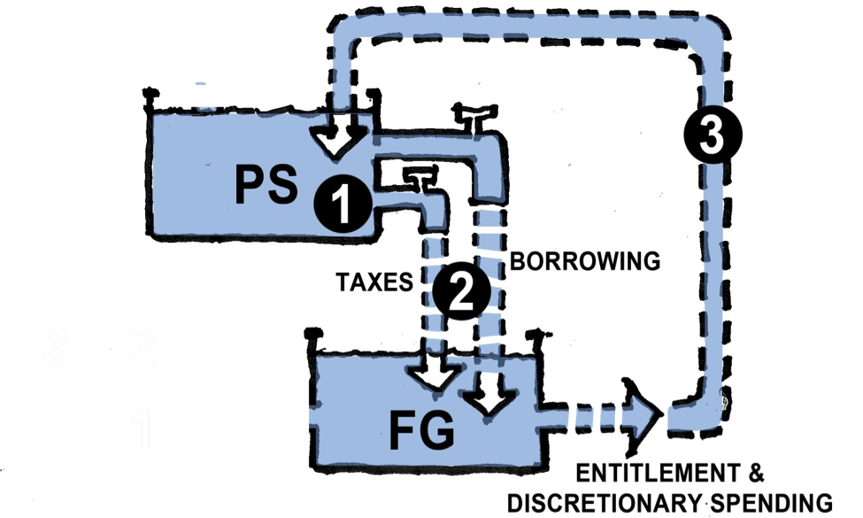
Here’s a simplified version that focuses on the direction of flow:
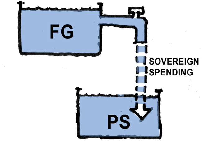
What we think we are seeing is this: Dollars get created in the PS pot and flow into the FG pot, from which they then flow, by means of government spending, back into the PS pot. The key thought-phrase here is “Dollars get created in the PS pot…” because it suggests that the PS pot is the “driver” or “generator” of the flow of Dollars. But if it is an unequivocal fact that only the sovereign U.S. Government can issue U.S. Dollars, then it must be the case that the FG pot is actually the “driver”—which means, first of all, we’ve got the diagram upside down! Basically, it should look like this:
4. Hmmmm…?
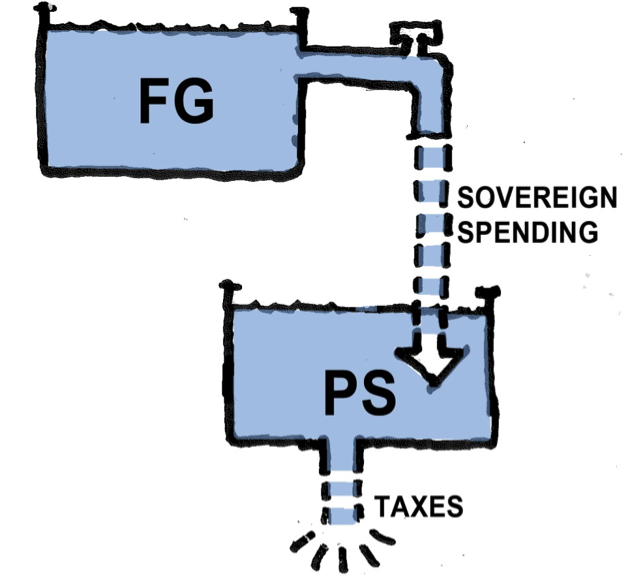
What we are seeing now is a completely new fiscal perspective: The sovereign government issues U.S. Dollars in the FG pot and then spends those Dollars through it’s own SPENDING spigot into the PS pot! Entrepreneurs in the Private Sector then use the Dollars the FG has issued and spent—leveraging them with bank loans and creative financing—to launch business ventures that generate private sector jobs and wages. Can this possibly be the way it actually is? Let’s see.
Before looking at this new diagram in more detail, let’s consider its most basic implication: As the FG spends, the number of Dollars in the PS pot grows. If the number of goods and services available for people to buy in the PS pot does not grow by an equivalent amount, the additional Dollars flowing in will cause prices to go up—perhaps dramatically. This is the “inflation” that Congressmen and economists are constantly warning against. To prevent this from happening—or to prevent the rate of inflation from getting disruptively high—there has to be some means for taking Dollars out of the PS pot.
This essential REMOVAL operation is accomplished with two pieces of “plumbing” we can now add, one at a time, to the new diagram:
The first plumbing addition is a “drain” that simply takes Dollars out of the PS pot and destroys them. This drain is Federal Taxes. Drained out and destroyed, Dollars paid in Federal taxes are no longer available for Private Sector spending—and, therefore, can no longer contribute to price-inflation.
Obviously, this plumbing feature—the TAX DRAIN—needs some further explanation: Why would the Sovereign Government destroy the tax Dollars it collects? Doesn’t it need those tax Dollars to pay for its spending? Shouldn’t the “drain” really be a sump-pump that lifts the tax Dollars back up and dumps them into the FG pot?
It would be a mistake, though, to add the “sump-pump” plumbing to our diagram. The reason is the underlying reality of what a U.S. Dollar actually is: It is simply a promise, by the U.S. sovereign government, that it will accept the Dollar as payment for a Dollar’s worth of taxes. That’s it. A Dollar—whether it’s a paper Dollar or an “electronic” Dollar—is nothing more than that promise. The sovereign government doesn’t promise to exchange a Dollar for gold or silver, or for anything else of intrinsic value. It promises only to accept the Dollar in exchange for the cancellation of a Dollar’s worth of taxes due. In other words, a Dollar is the I.O.U. of the sovereign government. The Dollar says: “I owe you one Dollar’s worth of tax credit.”
This I.O.U. means a lot more to all of us in the Private Sector (households and businesses) because we also use this I.O.U. Dollar for our MONEY—we use it to buy goods and services from each other, to invest in business ventures, and to save for future spending in our retirement. But at its most official heart, the U.S. Dollar is simply the I.O.U. promise of our sovereign Federal Government.
This underlying reality of what a Dollar actually is has a lot of importance for our new Diagram. First, it tells us why we (all of us citizens working in the Private Sector) are willing to accept Dollars in exchange for our very real goods and efforts: Because we need those Dollars in order to pay the taxes we owe the Federal Government! We can’t pay our taxes with apples or Pesos. We can only pay our U.S. Taxes with U.S. Dollars. So that’s why the FG SPENDING spigot works in the first place—because all the citizens and businesses in the Private Sector are willing to provide goods and services to the Federal Government in exchange for the Dollars they need to pay their Federal Tax bill.
The second thing the underlying reality explains is why the Dollar is “destroyed” when it is used to pay U.S. Taxes. You give the Federal Government back its I.O.U., the FG declares your taxes paid, and the I.O.U. is cancelled. That I.O.U. is of no further use to the Federal Government. It is illogical for the FG to “keep” an I.O.U. that says it owes something to itself. It could recycle the I.O.U. and use it to buy new goods and services from the Private Sector. But even that is illogical, because it is far easier and more efficient, when the Sovereign Government needs to spend again, for it to simply issue a new I.O.U. This is especially true since the vast majority of Dollars issued and spent are electronic—simple keystrokes on a computer screen.
So the “TAX DRAIN” really is the correct diagram! Federal taxes drain Dollars out of the Private Sector pot and—POOF!—they’re gone. How many Dollars should be drained every year to keep price-inflation in check is a crucial question, but we don’t need to answer that to get our diagram right. We do need to add some additional plumbing pieces, however. This is because there is a another, very important, means for taking Dollars out of the PS pot to control inflation.
**I am indebted to L. Randall Wray for first illustrating his “bathtub” metaphor in his book, “Modern Money Theory”.






Pingback: Diagrams and Dollars: Modern Money Illustrated (Part 1) | naked capitalism
Pingback: DIAGRAMS & DOLLARS: modern money illustrate...
Pingback: Diagrams and Dollars: Modern Money Illustrated (Part 1) | Jo W. Weber