In the previous blog, we did some heavy lifting. Unless you are an economics or accounting nerd, you found it quite boring. This week we will take a little break from pure accounting, and apply what we’ve learned to a real world example. By now, long-time readers are quite familiar with the NEP’s approach to the GFC (global financial crisis). Let us revisit the Clintonian Goldilocks economy to find the seeds of the GFC, using our sectoral balance approach.
To be clear, what follows uses our sectoral balances identity plus some real world data to provide an interpretation of the causes of the crash. As always, interpretations are subject to disagreement. The identity as well as the data are not. (You can of course always begin analysis with other identities and other data.) Next week we return to a bit more accounting.
Back in 2002 I wrote a paper announcing that forces were aligned to produce the perfect fiscal storm. (I note that in recent days a few analysts—including Nouriel Roubini—have picked up that terminology.) What I was talking about was a budget crisis at the state and local government levels. I had recognized that the economy of the time was in a bubble, driven by what I perceived to be unsustainable deficit spending by the private sector—which had been spending more than its income since 1996. As we now know, I called it too soon—the private sector continued to spend more than its income until 2006. The economy then crashed—a casualty of the excesses. What I had not understood a decade ago was just how depraved Wall Street had become. It kept the debt bubble going through all sorts of lender fraud; we are now living with the aftermath.
Still, it is worthwhile to return to the so-called “Goldilocks” period (mid to late 1990s, said to be “just right”, with growth sufficiently strong to keep unemployment low, but not so swift that it caused inflation) to see why economists and policymakers still get it wrong. As I noted in that earlier paper,
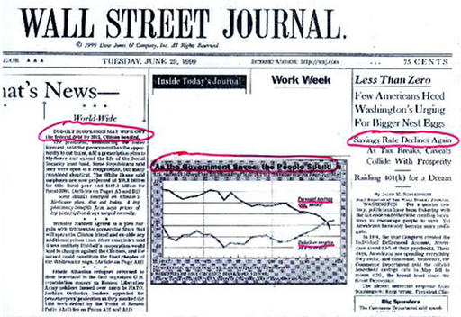
It is ironic that on June 29, 1999 the Wall Street Journal ran two long articles, one boasting that government surpluses would wipe out the national debt and add to national saving—and the other scratching its head wondering why private saving had gone negative. The caption to a graph showing personal saving and government deficits/surpluses proclaimed “As the government saves, people spend”. (The Wall Street Journal front page is reproduced below.) Almost no one at the time (or since!) recognized the necessary relation between these two that is implied by aggregate balance sheets. Since the economic slowdown that began at the end of 2000, the government balance sheet has reversed toward a deficit that reached 3.5% of GDP last quarter, while the private sector’s financial balance improved to a deficit of 1% of GDP. So long as the balance of payments deficit remains in the four-to-five percent of GDP range, a private sector surplus cannot be achieved until the federal budget’s deficit rises beyond 5% of GDP (as we’ll see in a moment, state and local government will continue to run aggregate surpluses, increasing the size of the necessary federal deficit). [I]n recession the private sector normally runs a surplus of at least 3% of GDP; given our trade deficit, this implies the federal budget deficit will rise to 7% or more if a deep recession is in store. At that point, the Wall Street Journal will no doubt chastise: “As the people save, the government spends”, calling for a tighter fiscal stance to increase national saving!
Turning to the international sphere, it should be noted that US Goldilocks growth was not unique in its character. [P]ublic sector balances in most of the OECD nations tightened considerably in the past decade–at least in part due to attempts to tighten budgets in line with the Washington Consensus (and for Euroland, in line with the dictates of Maastricht criteria). (Japan, of course, stands out as the glaring exception—it ran large budget surpluses at the end of the 1980s before collapsing into a prolonged recession that wiped out government revenue and resulted in a government deficit of nearly 9% of GDP.) Tighter public balances implied deterioration of private sector balances. Except for the case of nations that could run trade surpluses, the tighter fiscal stances around the world necessarily implied more fragile private sector balances. Indeed, Canada, the UK and Australia all achieved private sector deficits at some point near the beginning of the new millennium. (Source: L. Randall Wray, “The Perfect Fiscal Storm” 2002, available at http://www.epicoalition.org/docs/perfect_fiscal_storm.htm)
Let us revisit “Goldilocks” and see what lessons we can learn from “her” that help us to understand the Global Financial Collapse that began in 2007. As we now know, my short-term projections predicting the demise of Goldilocks into a recession were not too bad, but the medium-term projections were off. The Bush deficit did grow to 5% of GDP, helping the economy to recover. But then the private sector moved right back to huge deficits as lender fraud fuelled a real estate boom as well as a consumption boom (financed by home equity loans). See the chart below (thanks to Scott Fullwiler). Note that we have divided each sectoral balance by GDP (since we are dividing each balance by the same number—GDP—this does not change the relationships; it only “scales” the balances). This is a convenient scaling that we will use often in the MMP. Since most macroeconomic data tends to grow over time, dividing by GDP makes it easier to plot (and rather than dealing with trillions of dollars—so many zeroes!—we express everything as a percent of total spending).
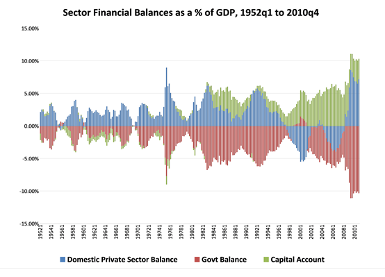
This chart shows the “mirror image”: a government deficit from 1980 through to the Goldilocks years is the mirror image of the domestic private sector’s surplus plus our current account deficit (shown as a positive number because it reflects a positive capital account balance—the rest of the world runs a positive financial balance against us). (Note: the chart confirms what we learned from Blog #2: the sum of deficits and surpluses across the three sectors must equal zero.) During the Clinton years as the government budget moved to surplus, it was the private sector’s deficit that was the mirror image to the budget surplus plus the current account deficit.
This mirror image is what the Wall Street Journal had failed to recognize—and what almost no one except those following the Modern Money approach as well as the Levy Economic Institute’s researchers who used Wynne Godley’s sectoral balance approach understand. After the financial collapse, the domestic private sector moved sharply to a large surplus (which is what it normally does in recession), the current account deficit fell (as consumers bought fewer imports), and the budget deficit grew mostly because tax revenue collapsed as domestic sales and employment fell.
Unfortunately, just as policymakers learned the wrong lessons from the Clinton administration budget surpluses—thinking that the federal budget surpluses were great while they actually were just the flip side to the private sector’s deficit spending—they are now learning the wrong lessons from the global crash after 2007. They’ve managed to convince themselves that it is all caused by government sector profligacy. This, in turn has led to calls for spending cuts (and, more rarely, tax increases) to reduce budget deficits in many countries around the world (notably, in the US and UK).
The reality is different: Wall Street’s excesses led to too much private sector debt that crashed the economy and reduced government tax revenues. This caused a tremendous increase of federal government deficits. {As a sovereign currency-issuer, the federal government faces no solvency constraints (readers will have to take that claim at face value for now—it is the topic for upcoming MMP blogs).} However, the downturn hurt state and local government revenue. Hence, they responded by cutting spending, laying-off workers, and searching for revenue.
The fiscal storm that killed state budgets is the same fiscal storm that created the federal budget deficits shown in the chart above. An economy cannot lose about 8% of GDP (due to spending cuts by households, firms and local and state governments) and over 8 million jobs without negatively impacting government budgets. Tax revenue has collapsed at an historic pace. Federal, state, and local government deficits will not fall until robust recovery returns—ending the perfect fiscal storm.
Robust recovery will reduce the overall government sector’s budget deficit as the private sector reduces its budget surplus. It is probable that our current account deficit will grow a bit when we recover. If you want to take a guess at what our “mirror image” in the graph above will look like after economic recovery, I would guess that we will return close to our long-run average: a private sector surplus of 2% of GDP, a current account deficit of 3% of GDP and a government deficit of 5% of GDP. In our simple equation it will look like this:
Private Balance (+2) + Government Balance (-5) + Foreign Balance (+3) = 0.
And so we are back to the concept of zero!